
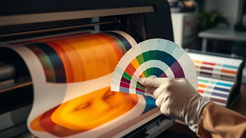
You pull a dtf transfers sheet off the printer, press it onto a shirt, and the red that looked perfect on screen comes out muddy orange. The customer shrugs, but you know what it means: a reprint, wasted film, and a dent in your reputation. Color inconsistency is one of the most frustrating and least discussed problems in DTF printing. Unlike paper printing, where a color profile can hide small shifts, DTF pushes ink through film, powder, and heat, and every step can nudge your colors off target. This guide walks through the variables that cause color drift and gives you a repeatable workflow to keep your prints consistent, whether you run a one-person shop or a small production floor.
Why DTF Color Drift Happens
DTF printing is a wet-on-wet process. Your printer lays down white ink behind a color layer, then you powder, cure, and press. Each stage introduces variables that paper printers never face. The most common culprits are ink lot changes, film batch differences, humidity swings, and printer settings that get tweaked without being recorded. When one variable shifts, your output shifts with it, and if you are not tracking those changes, you end up chasing color problems with guesswork.
The good news is that DTF color drift is rarely random. It follows patterns. Once you understand which variables affect which colors, you can isolate the cause and fix it without reprinting an entire order.
Build a Color Baseline Before You Change Anything
Before you can fix color drift, you need a reference point. Print a standard color target on your dtf printer and press it onto a known fabric, then keep that sample in a binder or on a wall. Label it with the date, ink batch, film brand, and printer settings. This baseline becomes your anchor. When a customer complains that a reorder looks different, you can compare the new print against the baseline and see exactly which colors shifted.
Choose a target that includes skin tones, brand colors, and a neutral gray. Gray is especially useful because it reveals color casts that are invisible in saturated colors. If your gray looks green or pink, your color channels are out of balance, and that will affect every print that follows.
Profile Your Printer and Respect the Profile
Many DTF printers ship with a generic profile that works okay for most jobs but is not tuned to your specific ink, film, and environment. Investing time in a custom ICC profile is one of the highest-return moves you can make. You can hire a color consultant, use a spectrophotometer if you have one, or follow a guided profiling workflow with your RIP software. The goal is to create a profile that accurately describes how your printer reproduces color on your chosen film.
Once the profile is in place, resist the urge to tweak it for every job. If a customer wants a specific Pantone color, adjust the file, not the profile. Changing the profile to fix one print will throw off every other job until you recalibrate, and you will lose the consistency you worked to build.
Keep a Settings Log
Write down every setting that affects color: print mode, resolution, ink limits, white ink density, drying time, powder application, cure temperature, and press settings. When a print comes out wrong, you can check the log to see what changed since the last good run. This simple habit turns color troubleshooting from a mystery into a checklist.
Manage Ink and Film Batches
Ink and film are not perfectly consistent from batch to batch. A new liter of cyan might be slightly more saturated than the last one, and a new roll of film might have a different coating thickness that changes how ink sits on the surface. When you open a new batch, print your baseline target and compare it to your reference sample. If the difference is noticeable, you have two options: adjust your profile slightly for that batch, or set the batch aside for jobs where color accuracy is less critical.
Store ink and film in a stable environment. Extreme heat or cold can alter ink chemistry and film coating, and humidity can affect how powder adheres. Keep your supplies in a climate-controlled area and let them acclimate to room temperature before use.
Control the Powder and Cure Stages
Powder and cure are where color can shift in ways that are hard to predict. Over-powdering can dull colors and create a hazy look, while under-powdering leaves the ink exposed and prone to cracking. Cure temperature that is too high can yellow the white ink and shift colors warm. Too low, and the powder does not fully melt, which affects both durability and appearance.
Use a infrared thermometer to verify your cure tunnel or oven temperature, and check it regularly. Small temperature swings are normal, but a drift of 10 degrees or more will show up in your prints. Keep a note of the ideal cure temperature for your film and powder combination, and stick to it.
Press Settings and Fabric Interaction
The press is the final variable. Temperature, pressure, and time all affect how the transfer bonds and how the colors appear. A press that is too hot can cause the ink to spread slightly, softening edges and shifting colors. Too much pressure can flatten the print and change its texture. Too little pressure leaves gaps that show as lighter patches.
Different fabrics also absorb ink differently. A 100% cotton shirt will look different from a 50/50 blend, even with the same transfer. If you are printing for a customer who will use multiple fabric types, press a sample on each fabric and note the differences. You can then adjust your press settings or warn the customer about slight variations.
When to Reprint and When to Adjust
Not every color difference warrants a reprint. Establish a tolerance level with your customers, especially for large orders. A slight shift in a dark color is often invisible in normal lighting, while a shift in a skin tone is immediately noticeable. Use your baseline samples to make the call. If the difference is within your tolerance, ship it. If not, adjust your process and reprint.
For dtf transfers near me customers who need quick turnarounds, having a clear color policy upfront saves arguments later. Show them a proof and explain that slight variations are normal. Most customers appreciate the honesty and will trust you more for it.
Frequently Asked Questions
How often should I recalibrate my DTF printer for color?
Recalibrate whenever you change ink batches, film brands, or major printer components. For steady production, a monthly check against your baseline target is a good habit. If you notice a sudden shift, recalibrate immediately rather than waiting for the scheduled check.
Can I use a standard ICC profile for DTF printing?
Standard profiles are a starting point, but they rarely account for the specific ink, film, and powder you use. A custom profile will give you more accurate and consistent results. If a custom profile is not feasible, test a few standard profiles and choose the one that matches your baseline most closely.
Why do my colors look different after washing?
Washing can affect color if the ink is not fully cured or if the powder did not melt properly. Under-cured prints may fade or crack, and over-cured prints can become brittle. Check your cure temperature and time, and make sure the powder is fully melted before pressing. A proper wash test on a sample will reveal whether your cure is solid.
Does humidity affect DTF color accuracy?
Yes. High humidity can affect how ink dries and how powder adheres, which in turn affects color. Keep your print area between 40% and 60% relative humidity if possible. If you are in a humid climate, use a dehumidifier and store film and powder in sealed containers.
What is the best way to match a customer's brand color?
Ask for a physical sample or a Pantone number, then print a test swatch and press it on the actual fabric. Compare the result under daylight and adjust the file if needed. Never rely on a screen proof alone, because monitors and printers interpret color differently.